WordPress Shortcode Tutorial for beginners

What Are WordPress Shortcodes?

Shortcodes are just that, short bits of code that cut down on repetitive strings of HTML, and can be inserted anywhere in your site.

For instance, you could create a shortcode to insert a call to action button, or to display a Google AdSense ad, or to create 3 columns of content without any HTML markup.

What do shortcodes look like?

A shortcode is a descriptive bit of text wrapped in square brackets, e.g. [adsense] – which could be dropped into your WordPress post to display a block of Google ads.

The question is, how does this save you considerable time?

Take a look at this button code I made for my client.

<a><span>Google</span></a></span>
Continue reading WordPress Shortcode Tutorial for beginners

Creating A Circle Using Div’s & CSS3

This will work in all modern browsers supporting border-radius: Chrome, Firefox, Opera, Safari.

To make this work in IE, you must download and use CSS3 PIE. The demo won’t work in IE, but that’s only because jsFiddle doesn’t host PIE.htc. It will work on your page.

About border-radius: 999px – I picked 999px so that you don’t have to bother defining the border radius for each different size circle. None of the browsers I tested in cared about the excessive number.

HTML

<div class="circleBase type1"></div>
<div class="circleBase type2"></div><div class="circleBase type2"></div>
<div class="circleBase type3"></div>
CSS 

.circleBase {
    -webkit-border-radius: 999px;
    -moz-border-radius: 999px;
    border-radius: 999px;
    behavior: url(PIE.htc);
}

.type1 {
    width: 100px;
    height: 100px;
    background: yellow;
    border: 3px solid red
}
.type2 {
    width: 50px;
    height: 50px;
    background: #ccc;
    border: 3px solid #000
}
.type3 {
    width: 500px;
    height: 500px;
    background: aqua;
    border: 30px solid blue
}

CSS3 Media Queries & Responsive Design Tutorial

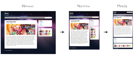
Users now use mobile phones, small notebooks, tablet devices such as iPad or Playbook to access the web. So the traditional fixed width design doesn’t work any more. Web design needs to be adaptive. The layout needs to be automatically adjusted to fit all display resolution and devices. This tutorial will show you how to create a cross-browser responsive design with HTML5 & CSS3 media queries.

Overview

The page’s container has a width of 980px which is optimized for any resolution wider than 1024px. Media query is used to check if the viewport is narrower than 980px, then the layout will turn to fluid width instead of fixed width. If the viewport is narrower than 650px, it expands the content container and sidebar to fullwidth to form a single column layout.

design-overview

Continue reading CSS3 Media Queries & Responsive Design Tutorial

How To: Avoid Duplicate Posts

I’m developing a new theme and I’m having trouble getting duplicate posts from showing when running two loops (one standard loop and one from a specific category). Even when I copied the specific code from directly from the codex, it was not working.

The Codex article the reader mentioned was regarding the Loop. Although the example shows how to avoid a single duplicate post, it doesn’t show how to avoid duplicating multiple posts.

Here’s how to show two individual loops without duplicating posts in either loop.

Continue reading How To: Avoid Duplicate Posts

Thesis custom page template with category posts

This turns the about page into a featured category post page. The principles for just a regular custom page template with sidebars is there too.


    function add_category_archives() {
    if (is_page('about')) {
    $limit = get_option('posts_per_page');
    $paged = (get_query_var('paged')) ? get_query_var('paged') : 1;
    query_posts('category_name=Featured&showposts=' . $limit . '&paged=' . $paged);
    //echo '
'; thesis_home_loop(); //echo '
' . "\n" . ''; }} remove_action('thesis_hook_custom_template','thesis_custom_template_sample'); add_action('thesis_hook_custom_template', 'add_category_archives');

How To: Create a Custom Page Template in Thesis

Custom page templates are the easiest way to make a whole new web design – inside of Thesis. Imagine, all of this space could be yours to code however YOU want… INSIDE of Thesis.

In this tutorial, I’ll show you how to create a custom homepage template, while using a conditional tag and a little custom PHP code.

Step 1. Create a new PHP page and name it home.php. Upload it to: /wp-content/themes/thesis/custom/

Step 2. Open custom-functions.php and paste this at the bottom of the file.


// Remove Default Page Template
remove_action('thesis_hook_custom_template', 'thesis_custom_template_sample');

// Custom Page Template
function custom_homepage() {
if ( is_front_page() ) {
include (TEMPLATEPATH . '/custom/home.php');
}
}
add_action('thesis_hook_custom_template', 'custom_homepage');

Step 3. Log-in to your WP Dashboard and click on Pages –> Add New

Step 4. Type “Homepage”, leave the content area blank, select “Custom Template”, and then click “Publish”

Step 5. Go to Settings –> Reading and check “A static page”, then select “Homepage”. Click Save.

Step 6. The Result:

Thesis: Applying Functions Only to Specific Pages

In this post, I’m going to introduce you to conditional statements, which let you specify which pages your function will apply to.

I’m going to use the exact same example I used in the earlier post so, as a reminder, here’s the full code for that.


function custom_text_box() {
?>

Isn't this a nice custom function?

<?php
}

add_action('thesis_hook_before_headline','custom_text_box');

Continue reading Thesis: Applying Functions Only to Specific Pages

5 Useful CSS Tricks for Responsive Design

Making the design to be responsive is very easy as shown in my Responsive Design in 3 Steps tutorial, but maintaining the elements to look aesthetically balanced on all breakpoint layouts is an art.

Today I’m going to share 5 of my commonly used CSS tricks along with sample cases for coding responsive designs. They are simple CSS properties such as min-width, max-width, overflow, and relative value — but these properties play an important part in responsive design.

1. Responsive Video (demo)

This responsive video CSS trick was discovered by tjkdesign.com. I’ve blogged about it before, you may read the details here. It makes the video embed to expand fullwidth to the boundary.


.video {
position: relative;
padding-bottom: 56.25%;
height: 0;
overflow: hidden;
}

.video iframe,
.video object,
.video embed {
position: absolute;
top: 0;
left: 0;
width: 100%;
height: 100%;
}

Continue reading 5 Useful CSS Tricks for Responsive Design

pagnation function using pagenavi plugin in wordpress


/*PAGINATION*/

function round_num($num, $to_nearest) {
/*Round fractions down (http://php.net/manual/en/function.floor.php)*/
return floor($num/$to_nearest)*$to_nearest;
}

/* Function that performs a Boxed Style Numbered Pagination (also called Page Navigation).
Function is largely based on Version 2.4 of the WP-PageNavi plugin */
function pagenavi($before = '', $after = '') {
global $wpdb, $wp_query;
$pagenavi_options = array();
$pagenavi_options['pages_text'] = ('Page %CURRENT_PAGE% of %TOTAL_PAGES%:');
$pagenavi_options['current_text'] = '%PAGE_NUMBER%';
$pagenavi_options['page_text'] = '%PAGE_NUMBER%';
$pagenavi_options['first_text'] = ('First Page');
$pagenavi_options['last_text'] = ('Last Page');
$pagenavi_options['next_text'] = 'Next »';
$pagenavi_options['prev_text'] = '« Previous';
$pagenavi_options['dotright_text'] = '...';
$pagenavi_options['dotleft_text'] = '...';
$pagenavi_options['num_pages'] = 5; //continuous block of page numbers
$pagenavi_options['always_show'] = 0;
$pagenavi_options['num_larger_page_numbers'] = 0;
$pagenavi_options['larger_page_numbers_multiple'] = 5;

Continue reading pagnation function using pagenavi plugin in wordpress