PDF Embed Shortcode

In this tutorial we discuss about pdf file. this code usually embed your pdf to the page that you can actually see the content of the pdf and you can set the width and the height. just copy this code into your function.php

function pdf_function($attr, $url) {
   extract(shortcode_atts(array(
       'width' => '640',
       'height' => '480'
   ), $attr));
   return '';
}
add_shortcode('pdf', 'pdf_function');

Usage

[pdf width="520px" height="700px"]http://static.fsf.org/common/what-is-fs-new.pdf[/pdf]
WordPress Shortcode Tutorial for beginners

What Are WordPress Shortcodes?

Shortcodes are just that, short bits of code that cut down on repetitive strings of HTML, and can be inserted anywhere in your site.

For instance, you could create a shortcode to insert a call to action button, or to display a Google AdSense ad, or to create 3 columns of content without any HTML markup.

What do shortcodes look like?

A shortcode is a descriptive bit of text wrapped in square brackets, e.g. [adsense] – which could be dropped into your WordPress post to display a block of Google ads.

The question is, how does this save you considerable time?

Take a look at this button code I made for my client.

<a><span>Google</span></a></span>

Continue reading WordPress Shortcode Tutorial for beginners

CSS3 Media Queries & Responsive Design Tutorial

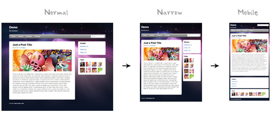
Users now use mobile phones, small notebooks, tablet devices such as iPad or Playbook to access the web. So the traditional fixed width design doesn’t work any more. Web design needs to be adaptive. The layout needs to be automatically adjusted to fit all display resolution and devices. This tutorial will show you how to create a cross-browser responsive design with HTML5 & CSS3 media queries.

Overview

The page’s container has a width of 980px which is optimized for any resolution wider than 1024px. Media query is used to check if the viewport is narrower than 980px, then the layout will turn to fluid width instead of fixed width. If the viewport is narrower than 650px, it expands the content container and sidebar to fullwidth to form a single column layout.

design-overview

Continue reading CSS3 Media Queries & Responsive Design Tutorial