Users now use mobile phones, small notebooks, tablet devices such as iPad or Playbook to access the web. So the traditional fixed width design doesn’t work any more. Web design needs to be adaptive. The layout needs to be automatically adjusted to fit all display resolution and devices. This tutorial will show you how to create a cross-browser responsive design with HTML5 & CSS3 media queries.
Overview
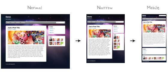
The page’s container has a width of 980px which is optimized for any resolution wider than 1024px. Media query is used to check if the viewport is narrower than 980px, then the layout will turn to fluid width instead of fixed width. If the viewport is narrower than 650px, it expands the content container and sidebar to fullwidth to form a single column layout.
Continue reading CSS3 Media Queries & Responsive Design Tutorial
 MosakWeb